Friends, enemies, people I've never met:
Sorry for the hiatus! I had a conference in Georgia that sort of threw off my whole rhythm. My last post was really serious (in some sense of the word), and so I thought we should explore something fun. Since it's NFL season and my Steelers are looking good, I thought we could talk about football. But since many of you might be "uninterested in the actual game of football" (read: "girls"), I thought we could talk about pretty shapes and colors.
And so, I announce the 5 best team logos in the NFL. And then a raging, passionate debate can ensue.
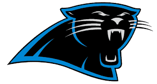
Number 5: Carolina Panthers
I saw some article online that ranked this, like, 27th in the NFL. The reason they gave is that it looks like the panther is "yawning". Yeah, either yawning or in the process of biting your face off. Not to mention that black and blue is a b.a. color combination.
Number 4: Tennessee Titans alternate logo
I don't even know if other teams have alternate logos. I think this one appears on the sleeve of the Titans' jerseys. It's cooler than their main logo because the T-shaped object is more obviously a sword. And swords are cool.
[Editor's note: Several other teams have alternate logos. They're pretty lame.]
Number 3: St. Louis Rams
Yes, a ram is technically a sheep. So theoretically, not very intimidating. But look at this logo. Just gaze at it, and notice the rising combination of awe, terror, and aesthetic joy in your soul. The colors, the horns... it's a big win for sheep.
Number 2: Denver Broncos
Ok, so I clearly like logos of violent-looking mammals with their heads pointing to the right. Two things set the Bronco ahead of his peers: his tiny, evil orange eye and the fact that his two colors -- orange and navy blue -- look fantastic together and make for the best uniforms in the NFL.
Number 1: Houston Texans
I can't really explain this. But I'll try: it's unique. The colors make for great uniforms. It overcomes an impossible team nickname like "Texans" with a cool intimidating cattle head with a star for an eye. And amazingly, it's really simple. If you're not artistically gifted, good luck drawing any of the other animal heads above. But a small child could draw this accurately with shis eyes closed. And yet it still looks awesome.
Worst logos: Giants, Saints, Vikings, Dolphins, Browns (no logo)
Tell me who got snubbed, or try to defend one of these basement-dwellers. Let me know what you think!
Jon


Definitely agree with the Dolphins... such a dumb logo.
ReplyDeleteVikings have a sweet logo. That guy looks tough and has great facial hair.
Buccaneers got snubbed. There are THREE swords in their logo!
I'm not actually stalking you, but this literally came across my feed as I was attempting to escape to bed. Clearly, this won.
ReplyDeleteNotably absent from your "angry mammals facing right" list are such winners as the "new-updated-but-still-an-unusual-shade-of-who-ever-heard-of-Honolulu-blue" Lions (awesome anyway, but I might be biased as they are, against all logic, my team) and the Jaguars (ugly).
Top 5, in no particular order:
Titans, Texans, Saints, new Falcons logo, Colts
Bottom 5, in no particular order:
Giants, Jets, Seahawks, Patriots, Browns
I definitely agree with the Browns, Dolphins, and Saints having the worst logos. I'd probably add the Cowboys in there--stars are not so intimidating unless it's a ninja star, which it's not. I'm also not a fan of the Titans alternative logo.
ReplyDeleteI think the Lions have a pretty good logo as well as the Texans.
Jon, I'm surprised the Steelers didn't make the Top 5 cut.
I'm gonna have to agree that the Texans is probably the best logo. Also, that alt. Titans logo is sweet too. Falcons should have definitely made the cut. Also, I like the Saints logo (who doesn't like a fleur-de-lis?)
ReplyDeleteDolphins logo is really stupid - first of all your team mascot is a dolphin, something I'd cuddle with before I felt threatened by. Then the dolphin has a football helmet on which looks retarded. Also, I noticed last year that the team helmets have sparkles in them. Noticing that, I thought the Dolphins was a bunch of guys I might do arts and crafts with, but a football team? nah
Other stupid logos: Jets, Chiefs, Patriots, Browns (bring back the elf!)
I already posted a new entry, but I didn't want to leave you loyal commenters stranded:
ReplyDeleteTim- Vikings guy has braided hair and, despite all the facial hair, looks like a girl. And the Bucs logo is boring.
Nick- I always love your comments. Thanks. And the new Falcons logo was on the bubble, probably the clear #6 on my list.
Heather- Yeah, anything that disses the Cowboys is good in my book. And while I love the Steelers, their logo leaves us all sort of scratching our heads... doesn't it?
Will- See reply to Nick about the Falcs. I will answer your fleur-de-lis question with a question: what the crap is a fleur-de-lis?